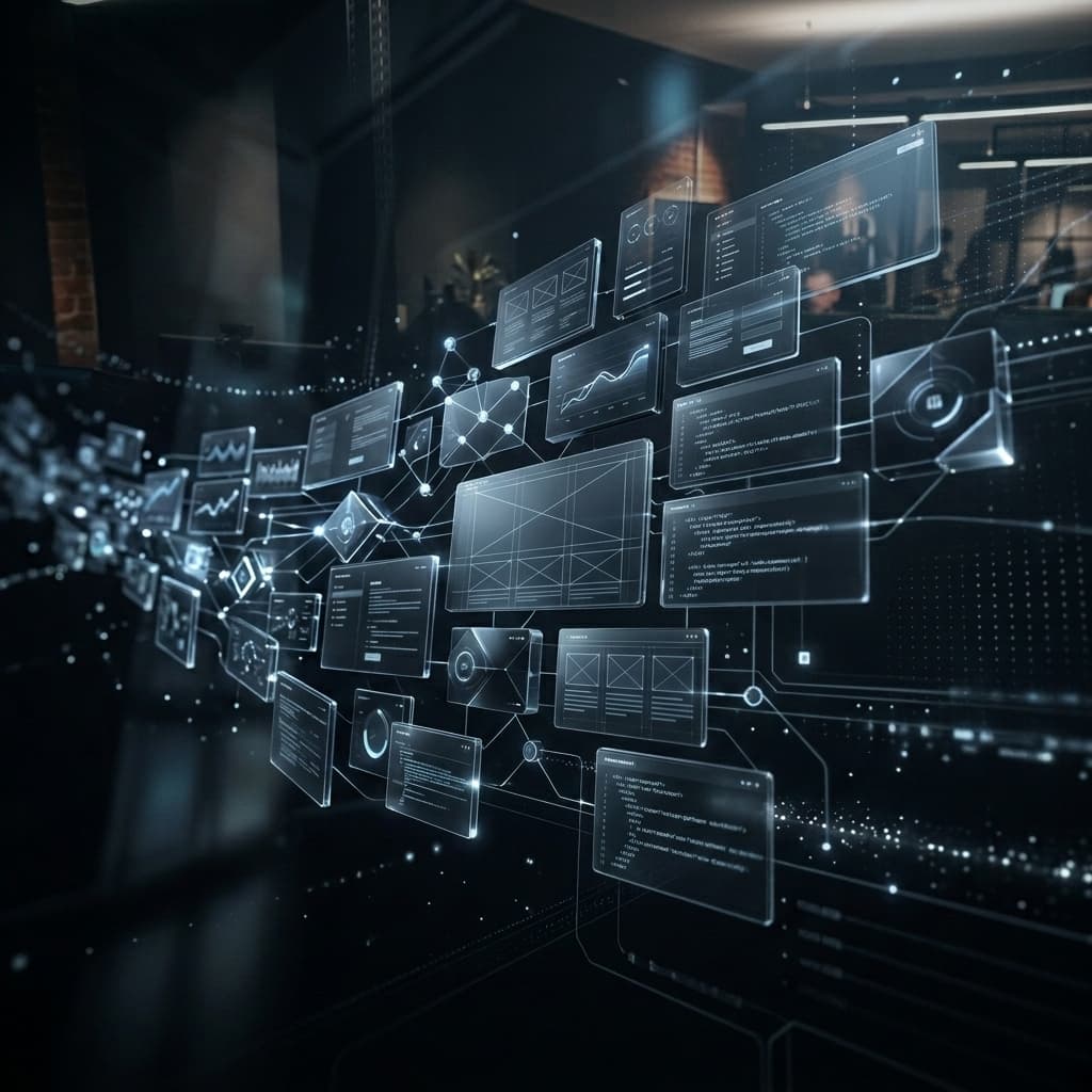
A website that brings in clients while you focus on growing your business
Today, a website is more than just a calling card online — it's your most dedicated salesperson, working around the clock with no days off. But it's worth understanding: web design isn't just about drawing pretty pictures. In the modern industry, the term covers the whole project, from the very first idea to the final launch. We build every project completely from scratch: we plan the logical structure, write persuasive copy, craft a unique visual identity, and write clean code without relying on ready-made templates.
Good design builds trust, shows off your professionalism, and gently nudges visitors towards a call or a purchase. If a site looks outdated or confusing, most people will simply close the tab and go to a competitor — even if your product is excellent. Our "Design & Development" approach makes sure your site doesn't just look great, but performs its business role perfectly too.
Solutions built for your goals: the types of projects we create
We build web products around your business goals and steer well clear of template-based approaches. For small and medium businesses, we create corporate websites that build trust in your brand and lay out exactly what your services offer. When the task is to launch a new product or campaign quickly, we design focused landing pages, where every block and line of copy is aimed at getting the visitor to enquire or call.
For online retail, we launch fully-featured online stores with a well-planned catalogue, cart, and payment integrations, making the buying process easy for your customers. If your business revolves around expert articles or news, we build content-driven sites with an intuitive CMS, so publishing new material and growing your outlet is easy.
A separate, and very important, part of our work is building complex web applications and portals with a personal account area. This isn't just an information display — it's a full digital service with its own internal logic and login system. In a project like this, your clients get their own personal section: they can track the status of a service, view their order history, work securely with documents, and manage their settings. For the business owner, a product like this means deep automation of routine work, less load on your staff, and a powerful admin panel with flexible roles and access permissions.
We also build tools that take routine work off your and your team's plate: booking and appointment forms with automatic confirmation, price calculators that work out a quote for the client instantly, and integrations with CRMs, payment systems, and email marketing services. These solutions don't need a separate account area — they slot straight into your existing site and start saving you time from day one after launch.
It's worth understanding that choosing a project type isn't a decision for life. Many of our clients start with a simple brochure site and, a year or two later, grow into a full portal with an account area and process automation — we design the architecture from day one so that growth like this is possible without rebuilding everything from scratch. Whatever kind of project you need right now, you get a foundation you can keep building on.
Web design trends: how we build modern websites
The world of web design never stands still, and one of the main principles we follow is deliberate minimalism. We strip out unnecessary visual noise, keeping only what actually matters for your business, and generous white space between elements gently guides the visitor's attention straight to your offer.
A responsive, lively interface matters too: a button that reacts subtly to a hover, or a block of text that fades in gently as you scroll, both create a sense of a polished, premium product. Dark Mode and subtle gradients serve the same purpose — many users find it more comfortable to read a site with a dark background, and it makes the design feel more premium too.
To organise content, we use modular grids — Bento-style layouts: complex information is neatly broken down into visual "cells", the interface looks orderly, and visitors find it easier to spot the service they need, on both desktop and mobile.
We also take accessibility seriously: high-contrast colours, large, legible typography, and predictable navigation widen your audience — nobody should ever leave for a competitor simply because they couldn't read the text. We reveal information gradually as visitors scroll, with no aggressive pop-ups — this calmer approach holds attention and builds trust far better than pushy advertising.
Smart architecture and invisible engineering
Beautiful design loses all its point if the site takes too long to load. Nobody likes waiting. Slow sites frustrate people and are heavily penalised by search engines, Google especially. That's why we only use leading-edge technology to get the best possible performance.
We choose the platform for your project deliberately, not out of habit. We only suggest WordPress — a PHP-based CMS — as the foundation for a brand-new site in two cases: if you've specifically asked for it because you're already familiar with the system and want a familiar interface to work in, or if we're redesigning or modernising a site that's already built on WordPress — in which case keeping the same platform saves you a content migration and re-training your team.
In every other case, we recommend a Next.js and headless CMS combination — Payload or Strapi, for example: the content and the admin panel are completely separate from what the visitor sees, so the site loads noticeably faster, scales more easily, and isn't limited by ready-made design templates. For online stores, Shopify often takes on the backend role in this setup — a proven platform for taking payments and managing orders and stock.
For complex services — the portals with their own account areas and custom logic we mentioned above — we also stick with Next.js on the front end, and use Node.js-based solutions on the backend. This lets us keep the entire system in one programming language (JavaScript/TypeScript) from front end to back end, which speeds up development, makes future maintenance simpler, and copes well with growing load as your business expands.
What we do to build an outstanding product
Building a quality project is a clearly structured process, not a burst of chaotic creativity. It all starts with in-depth research: we study your business, your competitors, and your target audience, so the future site solves real problems rather than just looking good.
Next, we create a free prototype — a structural blueprint of the future site, without the final design or copy, showing where each block sits and the logic of how visitors move between pages. This is also where we map out the user journey — the sequence of steps from the first click through to an enquiry or purchase — so nothing distracts or confuses the visitor. You sign off on the prototype before we start on design or build: changes at this stage cost next to nothing compared with reworking a finished site.
Once the prototype is approved, we move on to visual design — working out the colour scheme, typography, and the pixel-perfect style of every screen. You see the finished design and sign it off page by page before a single line of code is written: changes at this stage are still free and don't touch any finished build work.
Only once the design is approved does build and development work begin — we turn the approved mock-ups into code and connect them to the chosen platform (WordPress, or Next.js plus a headless CMS), so that after launch you can manage your site's content yourself.
Content is sorted out in parallel: you can hand over ready-made material about your company, or simply jot down some key points and facts about your business — we'll write persuasive, sales-focused copy for every block on the site, based on what you give us.
We also apply a strict Mobile-First approach — every button, line of text, and image is carefully tuned to work perfectly on a phone screen, since more than 60% of all traffic today comes from mobile devices.
Before launch, the site is tested across different browsers and devices — from the latest iPhones to budget Android phones — so that every visitor sees exactly what was intended, with no broken layout or unexpected bugs.
In the end, what you get isn't just a picture — it's a considered tool: every stage, from research through to final testing, serves one goal — turning a casual visitor into a client, not just making a striking first impression.